Fire Toast
Client Overview
Fire Toast is a bold new brand created by Amahle Ballo, designed to break away from a traditional family farm identity and carve out its own space. Targeted at a younger, adventurous audience, Fire Toast offers spicy, playful, and experimental berry and hot pepper preserves. The challenge was to create a brand identity and packaging system that reflects this vibrant personality while maintaining consistency across product lines and allowing room for future growth—both in-store and online.
My Role
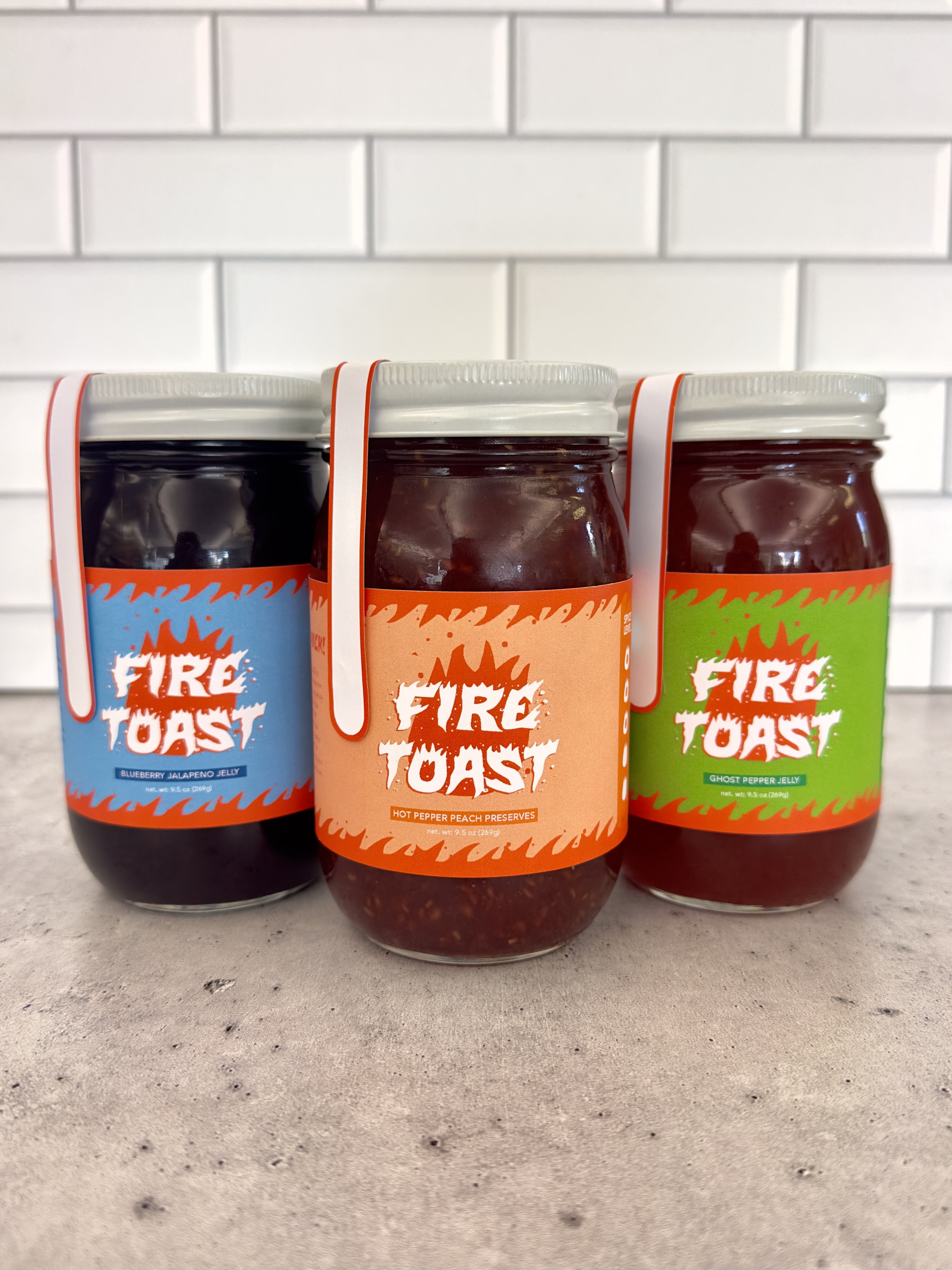
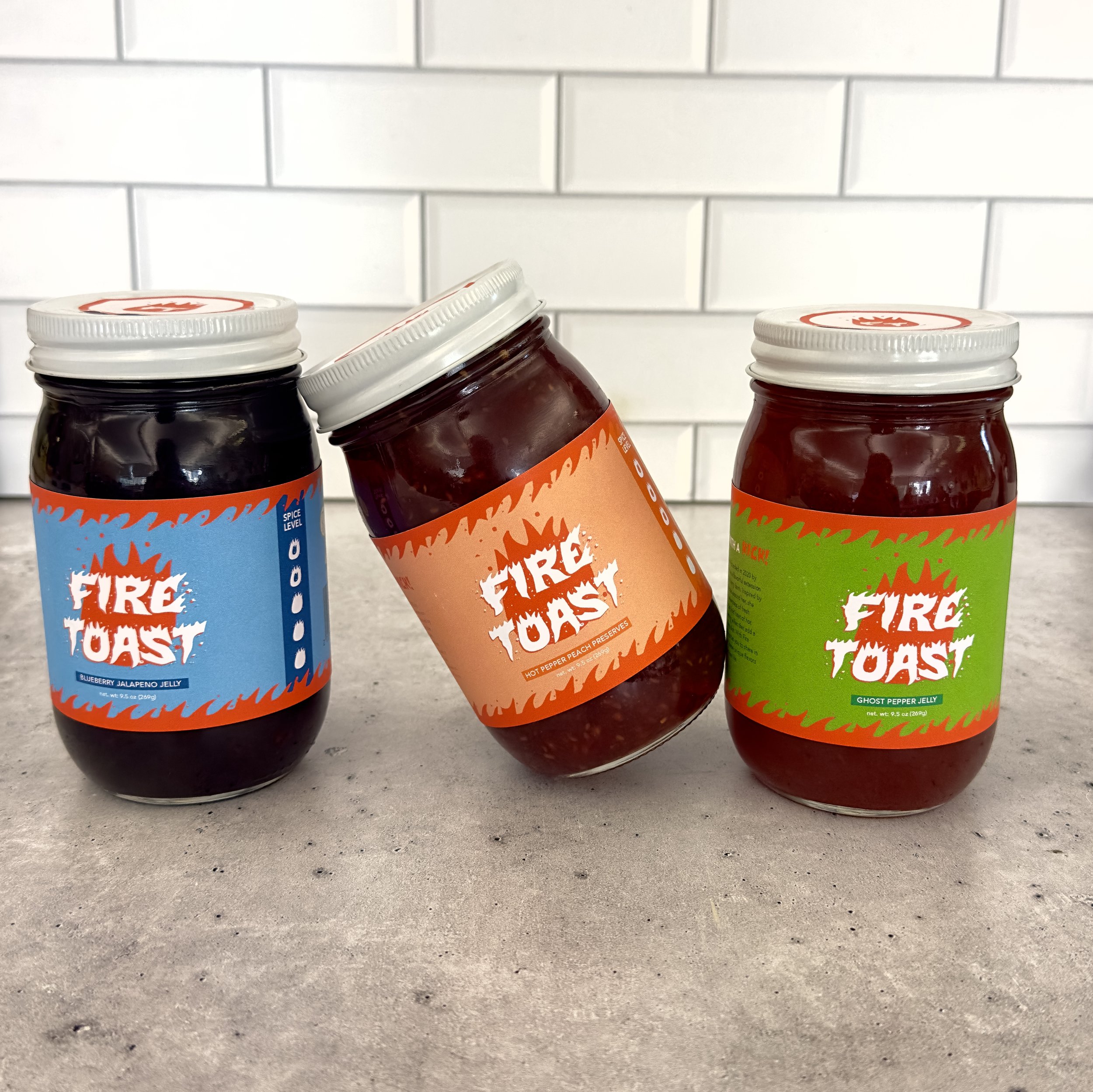
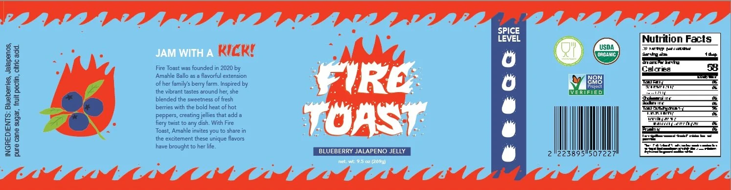
To bring Fire Toast to life, I developed a dynamic brand identity and packaging suite centered around energy, heat, and flavor. I designed a series of three vibrant jars, each featuring custom illustrations of fruits engulfed in flames to visually express the intensity and excitement of the product. The designs balance cohesion through a unified brand system while allowing each flavor to stand out with its own color palette and pattern. To enhance usability and storytelling, I incorporated spice level indicators, engaging product descriptions, and essential nutritional information. The packaging also includes a short narrative about Fire Toast’s origins, helping to build an emotional connection with customers and support the brand’s positioning as fresh, independent, and full of character.